| The SDL Component Suite is an industry leading collection of components supporting scientific and engineering computing. Please visit the SDL Web site for more information.... |

|
Home  GuiPack OnOffBut Using TOnOffBut GuiPack OnOffBut Using TOnOffBut |
|
  |
|
Using TOnOffBut |
|
|
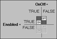
Buttons may be either singular buttons which have no relation to any other buttons, or combined into groups which show a common behavior in a way that only one of the grouped buttons is allowed to be in the "On" state. The grouping of buttons may be achieved by assigning a unique group number to the property GroupIndex of the respective button. Further, the property AllowAllOff can be used to specify whether all buttons of a group may be "Off" at the same time. The state of a button may be changed either setting the property OnOff, or by clicking at it. The reaction to a mouse click can be controlled by the property MouseAction, which allows to reduce the sensitive mouse area to the button glyph, or to even block any mouse response at all. Further, the behavior of the button may be controlled by the Mode property, which allows to switch between normal button (the button may be either "OFF" or "ON") and speed button behavior (the button is "ON" only as long as the left mouse button is down and over the sensitive mouse area). The button component offers four captions which can be set by the properties LeftText, RightText, BottomText, and TopText. The alignment of each caption can be controlled by the properties LeftTextAlignment, RightTextAlignment, BottomTextAlignment, and TopTextAlignment, respectively. The size, style, and the type of font of all captions can be specified by the Font property, the property ColorText controls the color of the captions. The background of the button component may be transparent or use a solid color which is specified by the ColorBackgnd property.
The overall layout of the component is defined by the properties FrameStyle,
Height and Width. The position of the button glyph may be either controlled by the properties LeftSpace and TopSpace. In the case the AutoCenter property is set to TRUE, the button glyph is centered, no matter which values are assigned to LeftSpace and TopSpace.
|
|
Last Update: 2023-Feb-06